
A Fortune 500 communications company faced a significant problem: its customers were having negative experiences with its customer service department.
After conducting an ethnographic survey of the customer service experience from both customer and agent perspectives, we pinpointed the workflow of customer service agents as the primary issue that required attention.
At the time of the research, the customer service workflow was a convoluted process that required agents to search multiple databases, on different networks, across different systems. This was the result of this Fortune 500 company’s two decades of rapid acquisitions and mergers of other entities whose systems were never fully integrated, both in terms of technology as well as back office, including accounting and CRMs.
Due to the convoluted system, customers typically waited between 2 to 5 minutes for their agents to locate their information, and often even longer to determine their equipment and account values, as well as find relevant information about their legacy services.
Following extensive design and human experience research, which included contextual enquiries, questionnaires, and quantitative analysis, we compiled a comprehensive report detailing the system’s opportunities and failings.
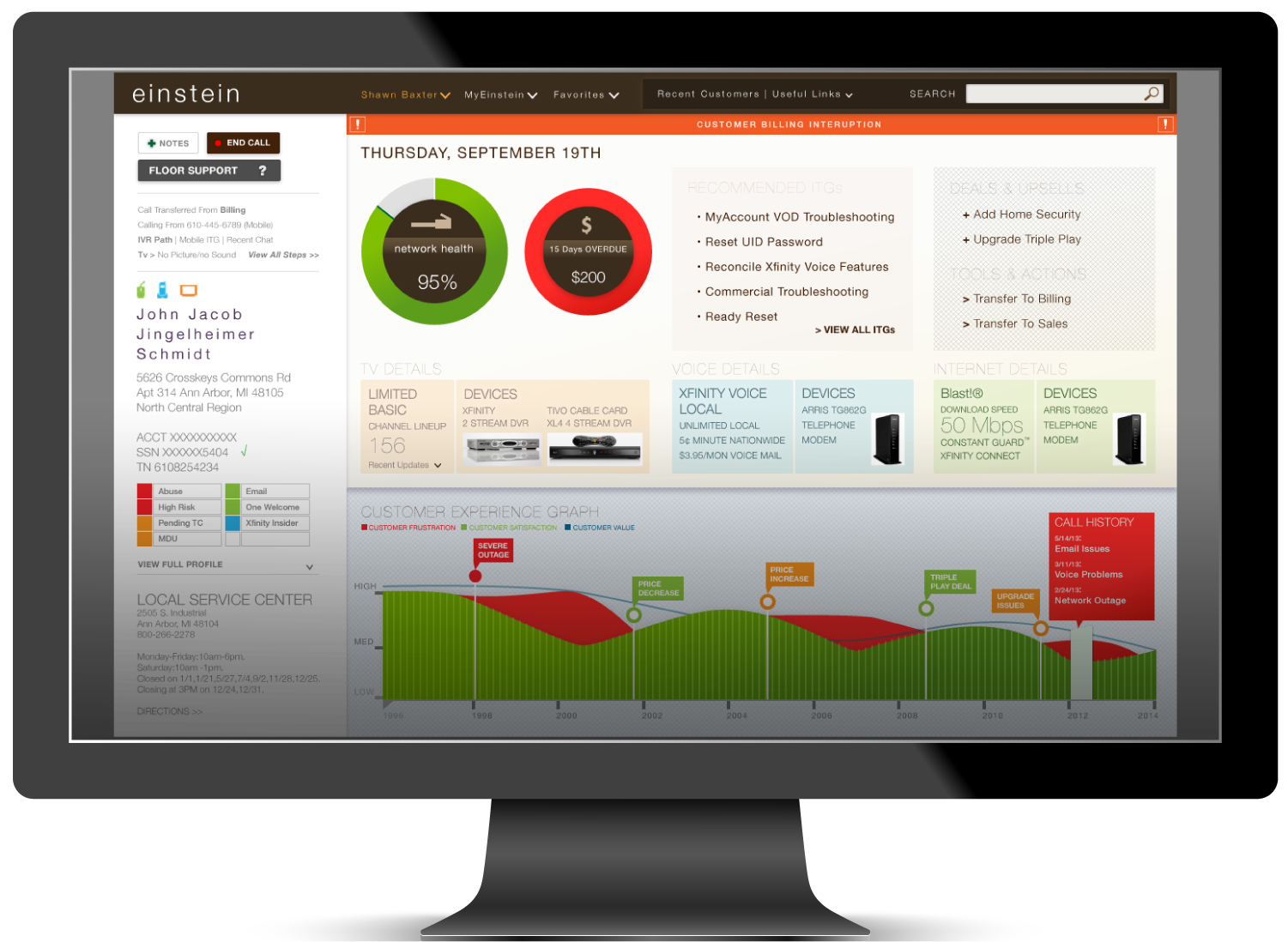
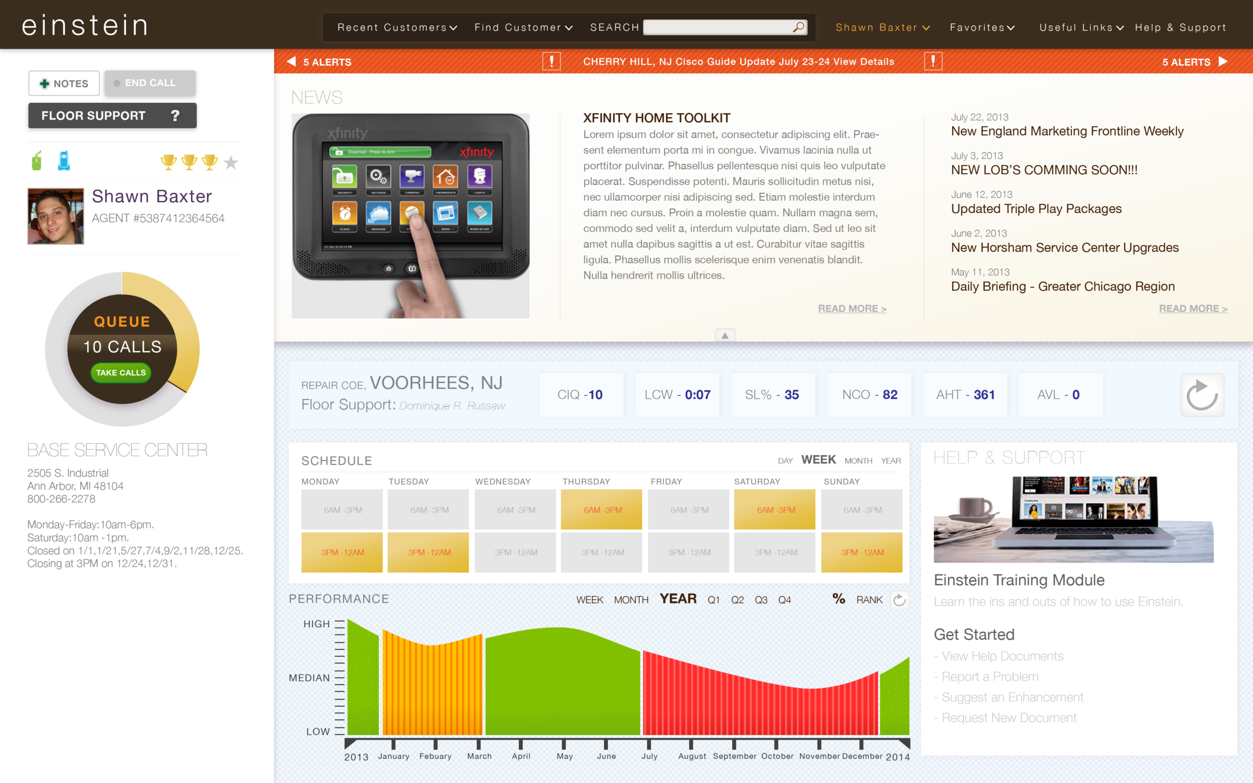
We determined that the best solution for the company was to create a single-screen tool that combined and simplified various data management displays into an easy-to-use and easy-to-understand dashboard system. The objective was to enable each agent to access customer information within a minute, rapidly identify the most relevant data points, and display them clearly, regardless of their hosting location.
By conducting comprehensive user research, including the creation of User Journey Maps for end users and service agents, I developed new task flow visualizations and wireframes of the agent’s dashboards, prioritizing clear and simple data display to provide a comprehensive overview of end customers’ needs and situations.
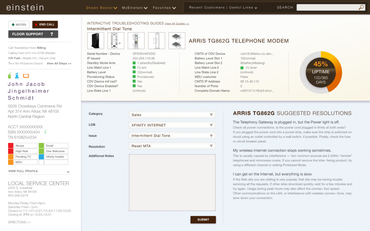
The new dashboard system provides a user-friendly interface that quickly presents necessary information, is easy to learn, and allows for in-depth analysis and drill-down into any datapoint, offering simple troubleshooting steps alongside specific customer information. Following additional research on emotional journeys, I explored aesthetic directions that prioritized the ergonomic comfort and ease of access for service reps, thereby reducing a major point of friction between agents and customers.
Here are the basic screens of this prototype.
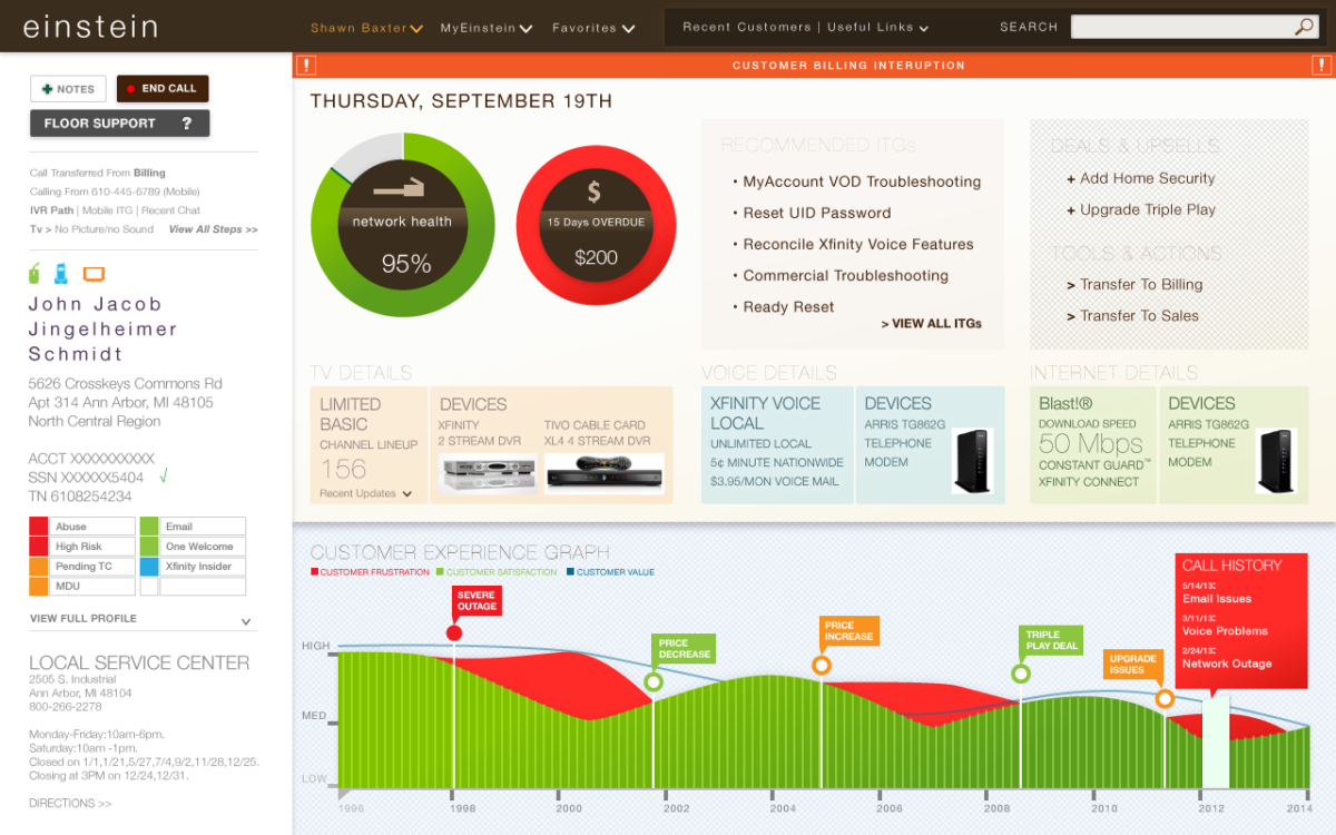
- Customer Engagement Main Screen
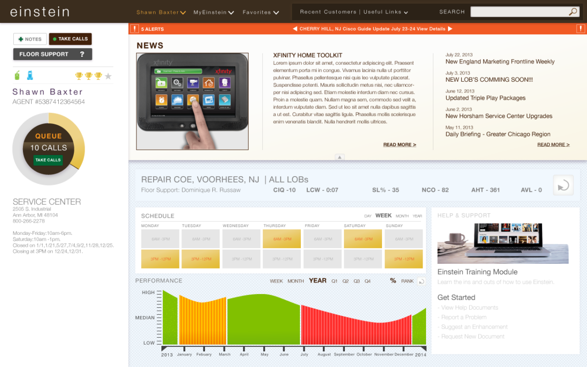
- Call scheduling screen
- Device Detail Screen
UX Process
- Qualitative User Research, through contextual inquiry, questionaires and usability studies of existing conditions
- Iterative ideation using anotated wireframes as a starting point
- Established the visual direction based on accessabilty, ease of use, reduction of hidden functionality and ergonomic comfort for typical long work hours. It was also important for it to be differentiated and standalone –A different tool with similar functionality but different purpose was used for B2C support teams; where as this tool was for the B2B team.
- With a “dress rehersal” interactive prototype, testing of usability, accessibility and comfort of the tool, with recorded contextual testing of the tool. To measure user behavior and comfort level using the tool with little additional instruction.