
As the product lead and art director at DotCom Community Connect Inc (CCI), I was responsible for the dating products within social communities.
Community Connect developed niche social networking sites for niche and special interest groups in the U.S., such as AsianAvenue, BlackPlanet, MiGente, and Glee.
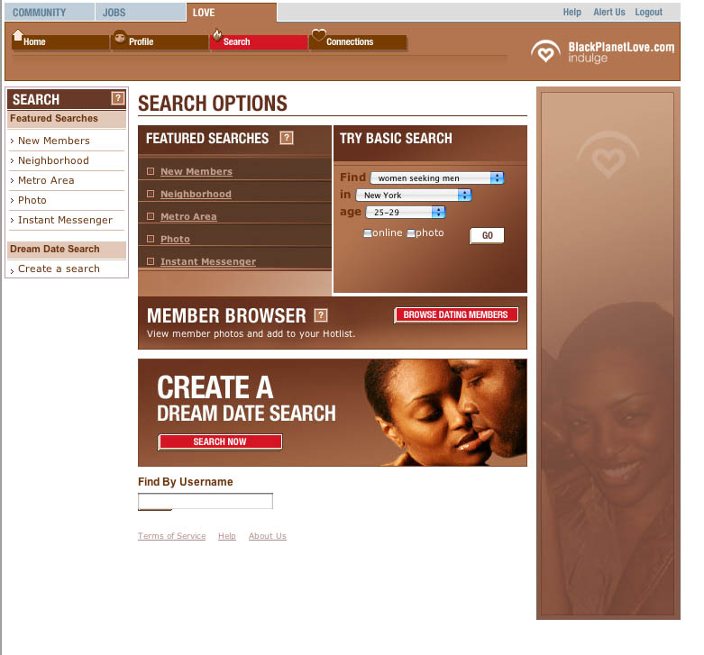
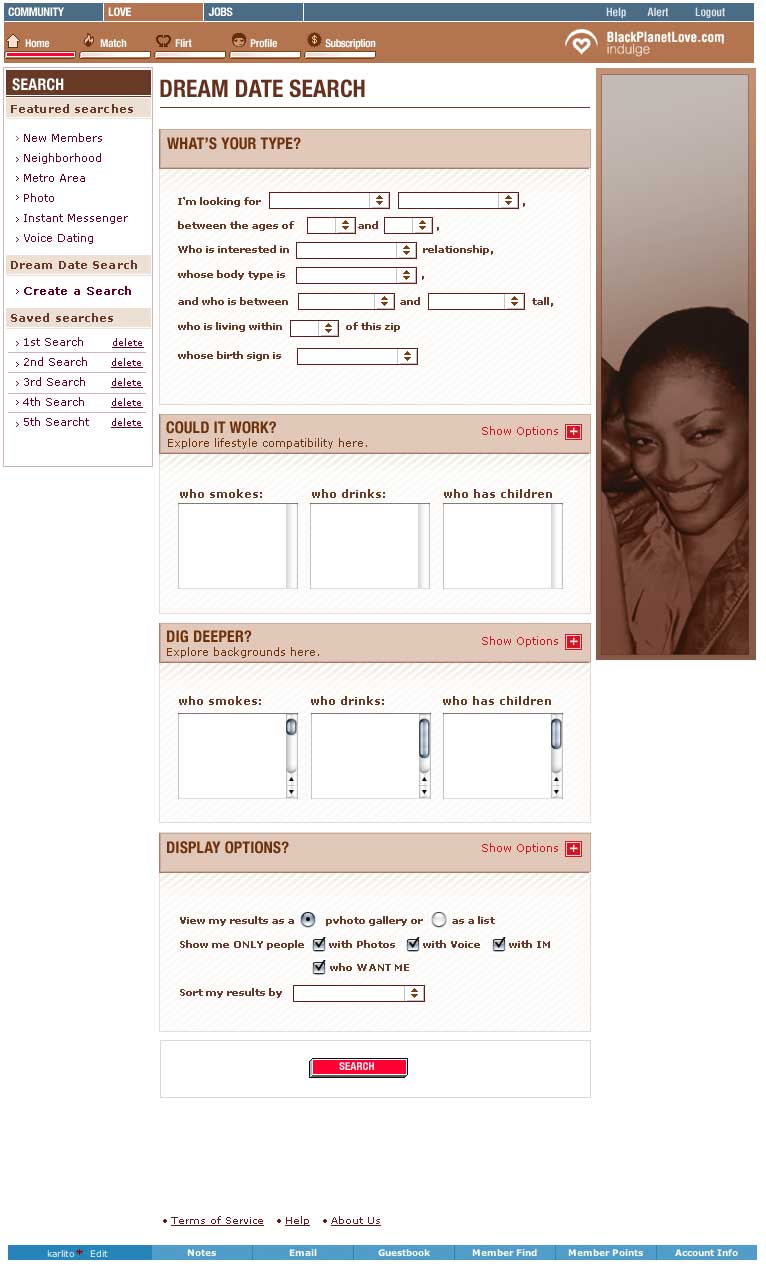
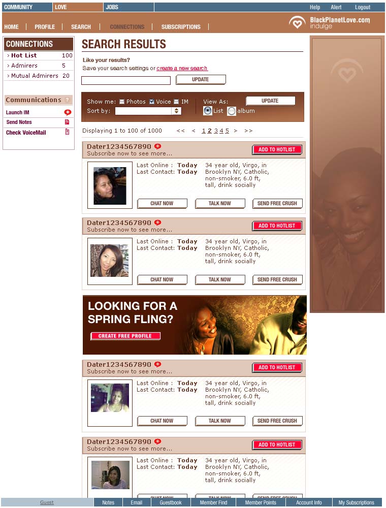
I was responsible for the visual design, UX research and design, as well as the production of dating products across various communities. The UX and backend of the dating product were the same between the different communities, but the UI was specifically branded for each. I led the marketing and advertising efforts for the dating sites, both within and outside of the community sites.
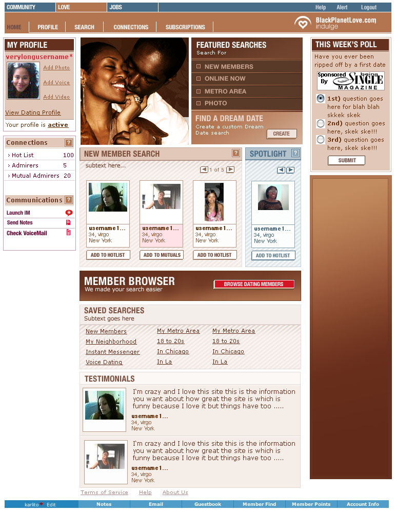
BlackPlanet LOVE was a dating site catering to the blackplanet.com community, which was the largest online gathering of a single US-based ethnic group at the time.
I collaborated with the product strategist and product lead to develop various website facilities and features, while overseeing the work of 2 designers and a front-end developer and liaising with the backend and system engineers assigned to the dating products.
Based on the strategists’ quantitative research and our data dashboard, we developed new product features and implemented both reactive and active advertising and marketing campaigns to increase new sign-ups and our active subscriber base.
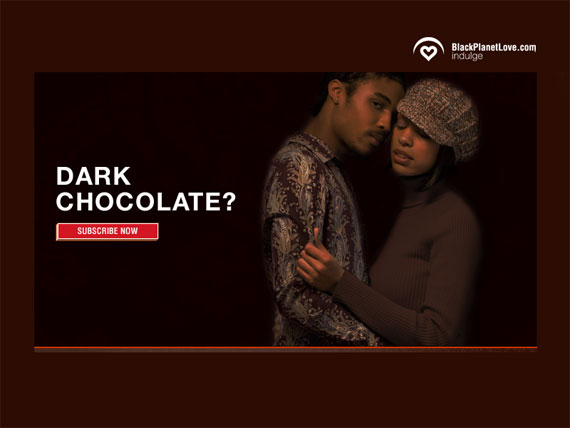
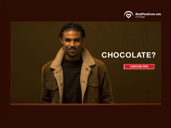
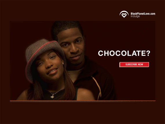
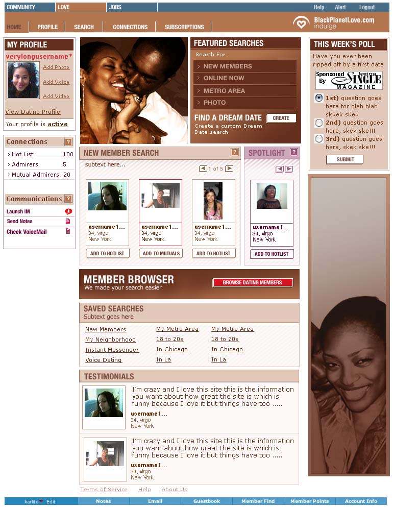
I envisioned the launch campaign based on the idea of ‘Hot Chocolate, with a cherry on top.’ The concept involved using high-quality photographs and rich shades of brown, ‘gold,’ and red, accompanied by evocative copy that alluded to the connection between brown skin and chocolate.
Stylistically, the goal was to promise a luxurious, sensual, and rich experience like expensive brands such as Godiva chocolates.
The site previously featured a visual style, characterized by decorative patterned backgrounds, which were later replaced by the clean gradient style of the “chocolate” campaign.
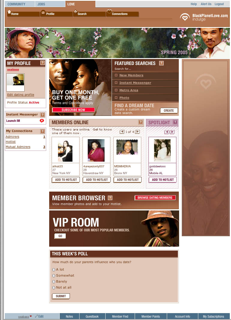
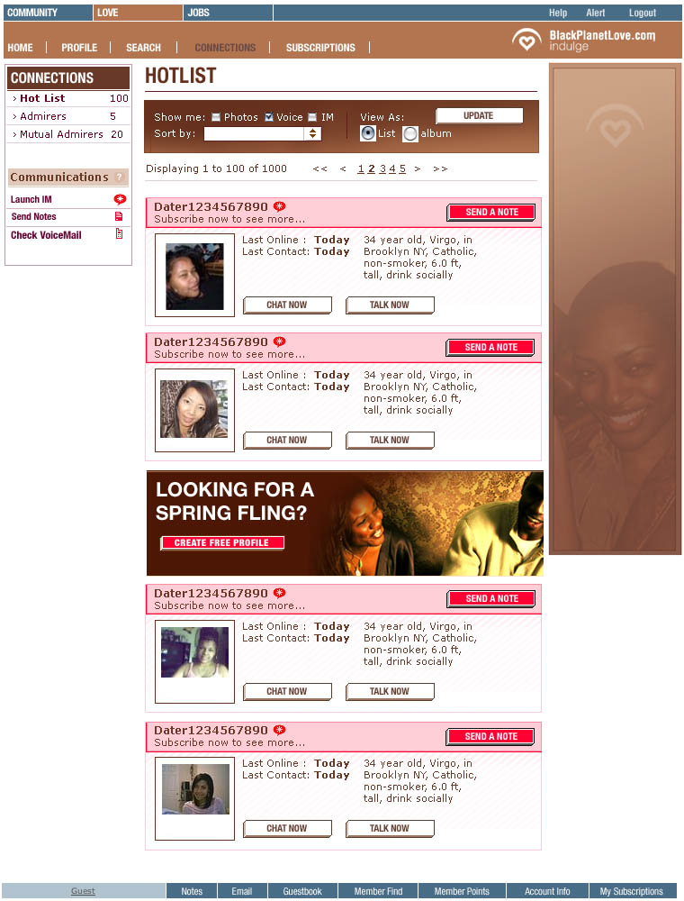
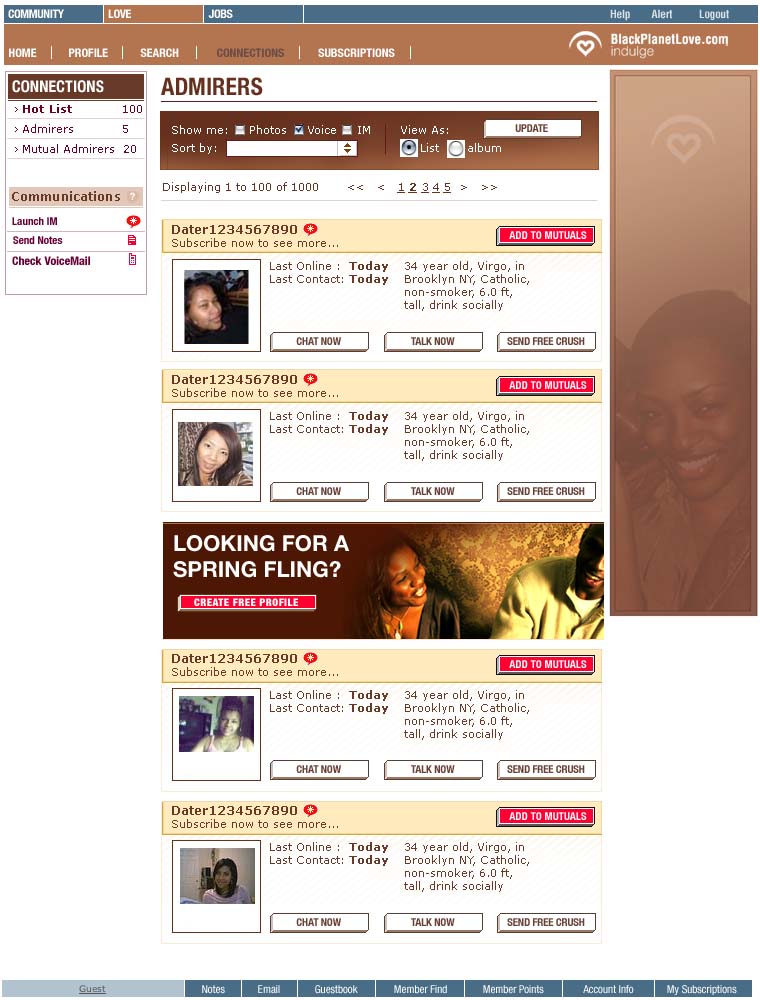
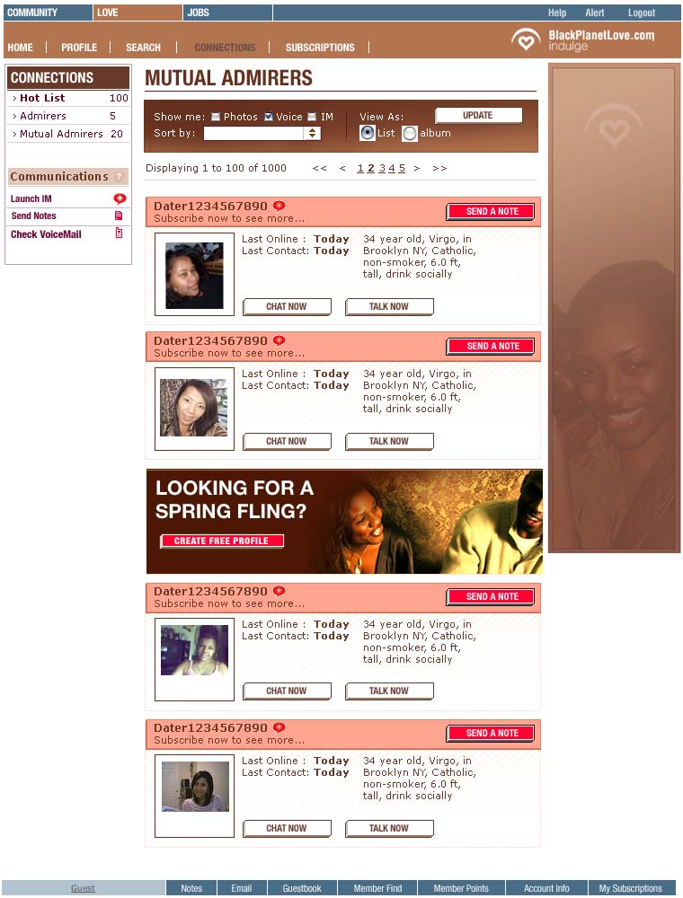
Above are some samples of the branding and marketing work for the website. These “login interrupt” units were used to encourage people to sign into the dating site, rather than browsing anonymously.
These specific units were part of the launch marketing for the second version of the dating site, which included a focused rebrand, as well as new features, facilities and tools.
I oversaw the creative and styling aspects of the launch campaign, planning and directing photo shoots with photographer Alex Wright and a makeup artist, resulting in a library of photographs that could be used throughout the year to cover major holidays and dating milestones.
In the past, we arranged ad hoc photoshoots with select community members and held community-wide contests to find talent; then, the senior designers and I would conduct the photoshoots, capturing material for a few specific campaigns or events at a time. The images with the decorative brown background patterns are my photography.
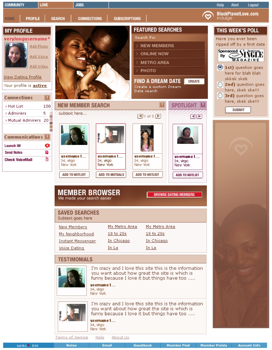
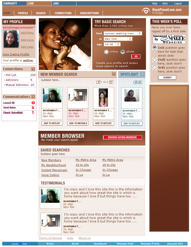
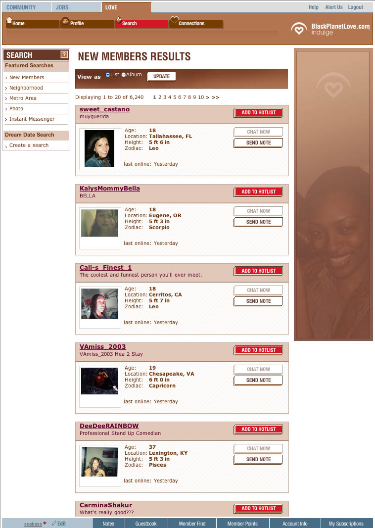
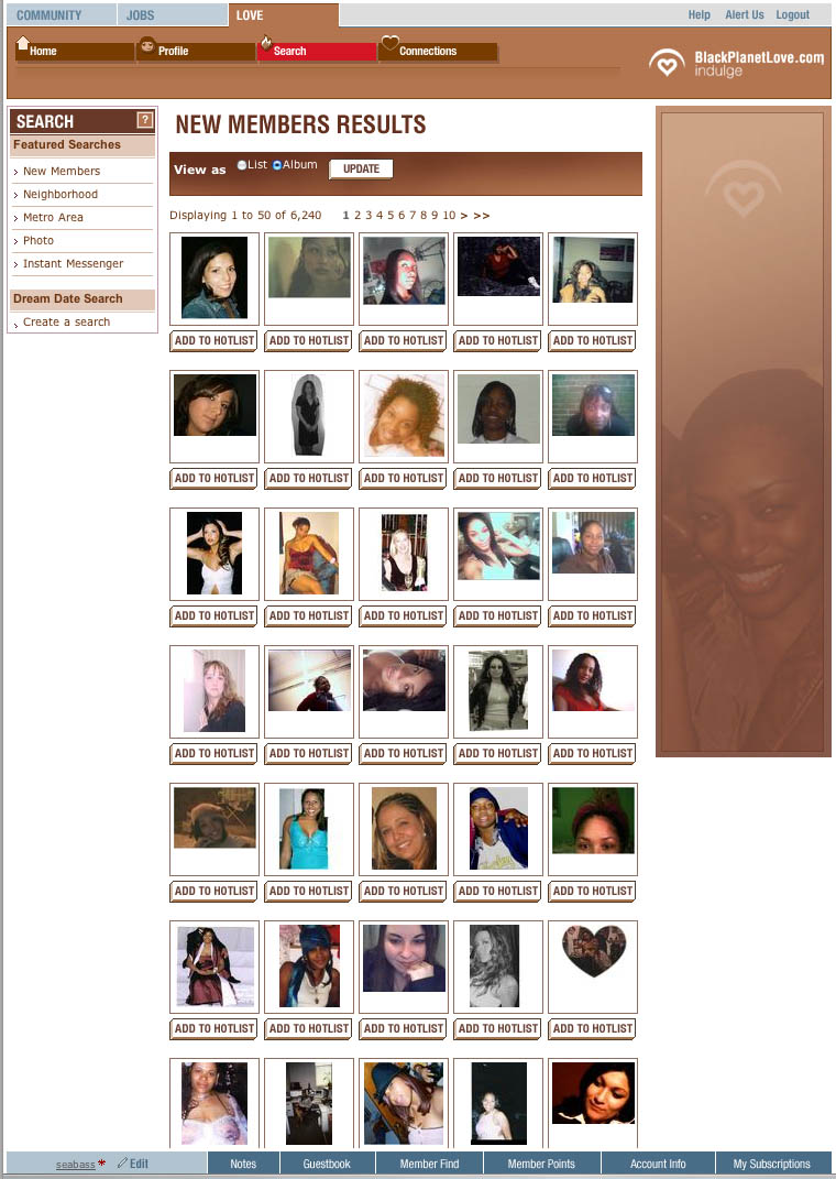
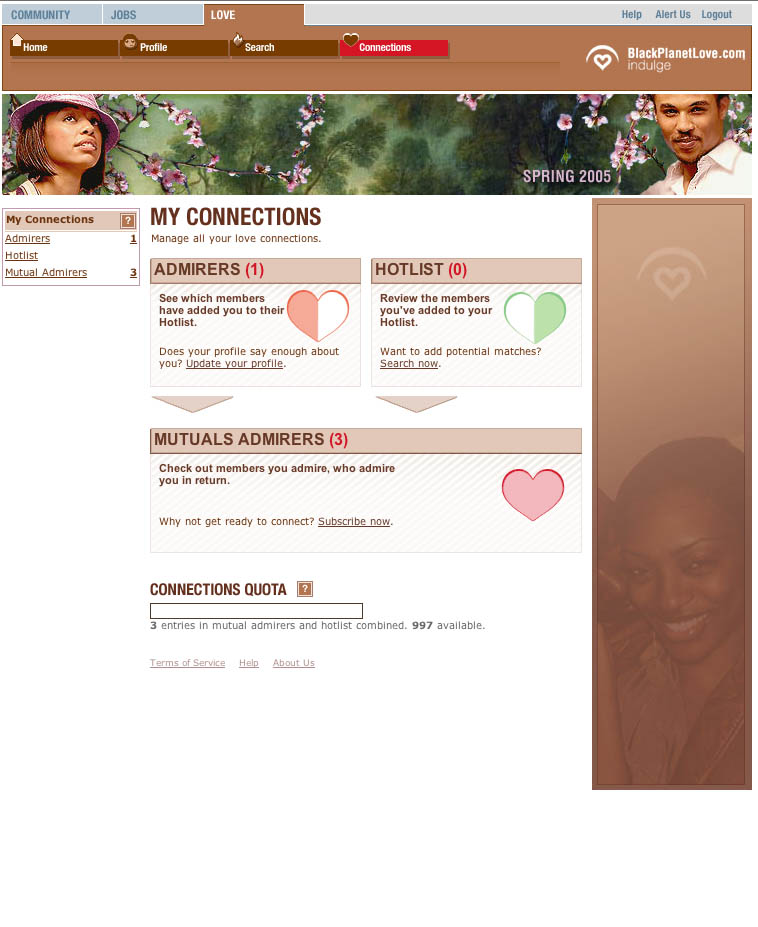
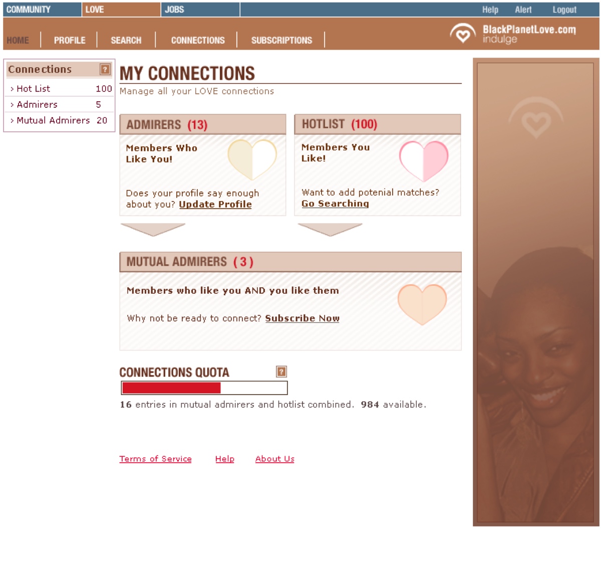
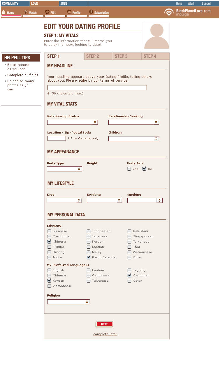
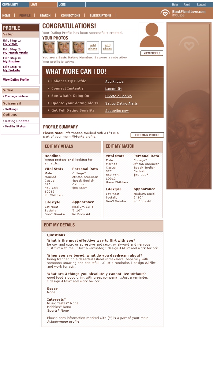
The examples below showcase the UI design of the website integrating the “chocolate” styling, as well as both our older visual style in ads, featuring decorative patterned backgrounds, and our new direction, characterized by clean chocolate gradient styling without the ornate background decorations.
")
")
")


